Pixel Watch and Pixel Watch 2 users will now see a new look when charging their smart watch. These devices now have access to the charging screen that was introduced with the Pixel Watch 3.
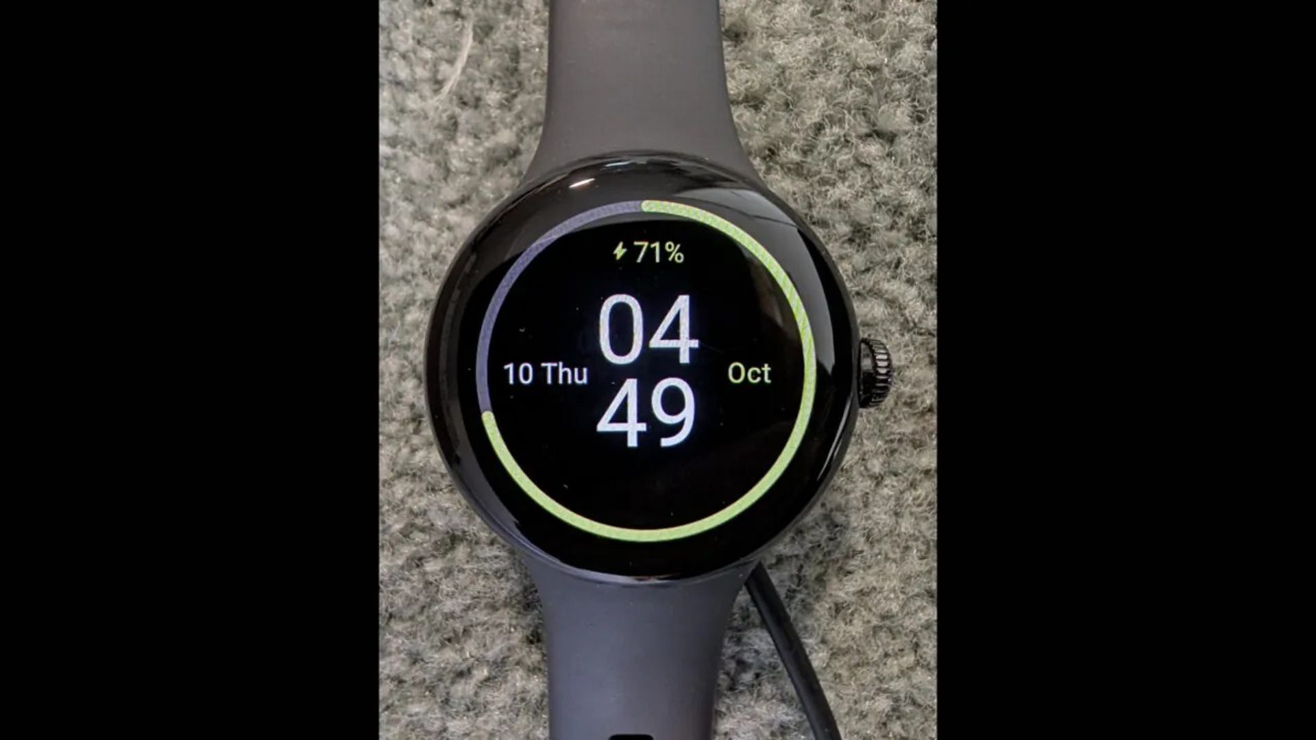
In the image published on Reddit, the Pixel Watch can be seen connecting to the charger. This photo shows that the display of the older models of the Google Smart Watch also got access to the new look. Compared to the previous charging screen, the updated design has mostly the same features, but includes more details.

Photographer: u/_Intel_Geek
The first change is that Google has removed the moving ring around the screen and replaced it with a fixed progress ring. In the new page, only the animation is displayed at the beginning of its opening. However, like the old design, we still see a numerical value for the watch’s charge level and the current time in the center of the screen. The time color is now white and not the same as the ring color. The ring itself is green instead of blue.
The new design also displays more useful information, including an estimate of how long the device will need to reach full charge. This change can be very useful for users who want to manage their time.
Unlike in the past, the day and date are no longer displayed at the bottom of the screen, instead, they are placed to the left of the time and the month is displayed to the right. If the user has a timer running, the timer occupies the left side of the screen and moves the day and date to the right. These changes are minor, but it’s exciting to see older devices updated.


